yVideo
Description
The yVideo component serves as a powerful tool primarily designed for displaying a video. It's an adaptable element that allows both static and dynamic content.
Some uses for the yVideo are:
Basic Structure
In the following the basic structure of the yVideo shall be explained. For the general structure of a yComponent please visit the yBase-components basic-structure.
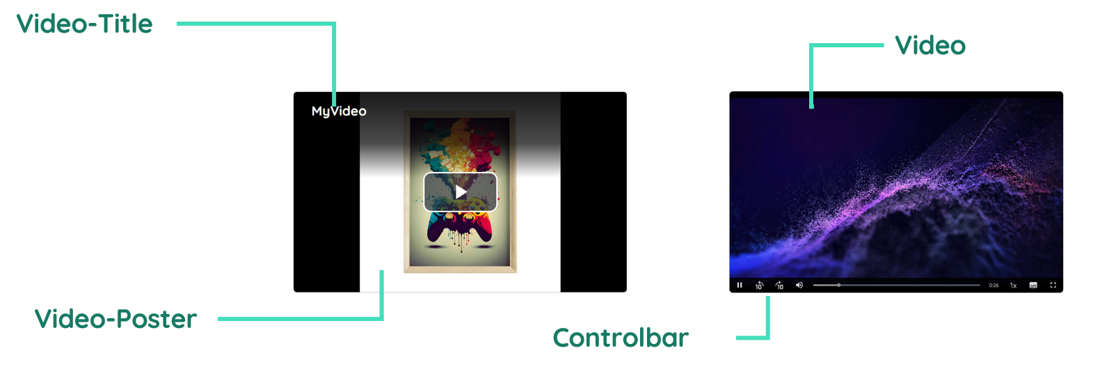
Title
The header contains the title and description of the video and is displayed while playing and while being paused.
Video
The video itself represents the core element of the component.
Controlbar
The controlbar contains all elements which are connected to an event, like play/pause, a progress bar, the full screen toggle, the skip buttons, the playback rates, the picture in picture control and the submenu.
Properties
Through its various properties the yVideo can be configured to suit your needs. The display below provides you with an overview of all the yVideo properties.
Properties can be changed directly through three methods:
- Inside the Toolbar, which is positioned in your workarea next to your component right where you need it. It shows the most important properties, thus providing a fast and efficient way to configure your component in the most basic way.
- It may also occur in the Toolbar Extension, which is a seamless extension accesible as a dropdown item of the Toolbar. It extends the functionality of the Toolbar by providing advanced pickers for the most used properties.
- Inside the Detail Panel, which is located in the righthand drawer. Every property of a component can be configured here.
- Generic
- Style
- Video
- Links
- Events
METAread more
The identifier of the component that is unique within a page.
The type of the component. For this component it is -video.
The custom name of the component. It serves for better identification of the component.
The custom version of the Video-component. This can be used to ensure that all components work well together.
The CoreTheme, which will be apllied to the Video. For further information on themes visit the themes page.
The subtheme subordinated to the previously specified CoreTheme, which will be apllied to the Video. For further information on themes visit the themes page.
The group theme is a further variation of the subtheme which is specified especially for variations of a component inside the subtheme. For further information on themes visit the Theme-Manager page.
DISPLAYread more
This property specifies the display behavior of the component. This can be be set to:
- none
- block
- flex
- inline
This property specifies the type of positioning method used for the component. This can be be set to:
- static
- relative
- absolute
- sticky
- fixed
This property can toggle the visibility of the component. The two modes are completely hidden and fully shown.
SIZEread more
The minimum value for the width of the component. This can be set in:
- px
- pt
- em
- vw
- vh
- %
The minimum value for the height of the component. This can be set in:
- px
- pt
- em
- vw
- vh
- %
The value for the width of the component. This can be set in:
- px
- pt
- em
- vw
- vh
- %
- auto
The value for the height of the component. This can be set in:
- px
- pt
- em
- vw
- vh
- %
- auto
The maximum value for the width of the component. This can be set in:
- px
- pt
- em
- vw
- vh
- %
- none
The maximum value for the height of the component. This can be set in:
- px
- pt
- em
- vw
- vh
- %
- none
The flex property sets the length on flexible items. This sets the value in n-fold shares extrapolated to all other components with the flex display within the same container.
PLACEMENTread more
This property creates a space around the component, outside of the top border. This can be set in percent or pixels.
This property creates a space around the component, outside of the right border. This can be set in percent or pixels.
This property creates a space around the component, outside of the bottom border. This can be set in percent or pixels.
This property creates a space around the component, outside of the left border. This can be set in percent or pixels.
This property creates a space within the component, inside of the top border. This can be set in percent or pixels.
This property creates a space within the component, inside of the right border. This can be set in percent or pixels.
This property creates a space within the component, inside of the bottom border. This can be set in percent or pixels.
This property creates a space within the component, inside of the top border. This can be set in percent or pixels.
BACKGROUNDread more
The color of the background. This can be set as a color from a palette or a custom hex color.
BORDERread more
The color of the top border. This can be set as a color from a palette or a custom hex color.
The style of the top border. This can be be set to:
- solid
- dotted
- dashed
- none
The width of the top border. This can be set in percent or pixels.
The color of the right border. This can be set as a color from a palette or a custom hex color.
The style of the right border. This can be be set to:
- solid
- dotted
- dashed
- none
The width of the right border. This can be set in percent or pixels.
The color of the bottom border. This can be set as a color from a palette or a custom hex color.
The style of the bottom border. This can be be set to:
- solid
- dotted
- dashed
- none
The width of the bottom border. This can be set in percent or pixels.
The color of the left border. This can be set as a color from a palette or a custom hex color.
The style of the left border. This can be be set to:
- solid
- dotted
- dashed
- none
The width of the left border. This can be set in percent or pixels.
The radius of the corners of all the borders. This can be set in percent or pixels.
SHADOWread more
The shadow of the component. This is set by the 4 sub-properties x, y, blur and spread of the shadow-property, which can be further read about in the shadow-property section.
OPACITYread more
The opacity of all colored parts of the component. This value is set in percent.
PLAYERBASICSread more
The language which controls the related options for the player.
The general font family for text elements.
PLAYERMODEread more
This property control whether it is audio only mode.
This property control whether it is audio only mode, displaying the thumbnail aswell.
The autoplay option enables autoplay to start the video when being loaded.
This option triggers the video to play in a loop when enabled.
PLAYERSTATEread more
This property control whether it is audio only mode.
This property control whether it is audio only mode, displaying the thumbnail aswell.
The autoplay option enables autoplay to start the video when being loaded.
CONTROLBARread more
The icon size controls the actual size of the control elements.
The color of the icon inside the control elements.
The background color of the control bar.
The background color of the single control elements.
CONTROLOPTIONSread more
This property controls, whether the button to toggle full screen mode will be displayed or not.
The csv string passes the possible playback rates to the player.
The property to select the time to skip backward and forward with the skip button.
A list of tracks to passe as subtitles or commentaries.
VIDEOread more
The actual source of the video.
The type of the video which should be played.
The so called thumbnail of the video.
VIDEOTITLEread more
The text which is displayed as the title.
The font size which applys to the title.
The font color which applys to both the title and the description.
The text which is displayed as the description.
The font size which applys to the description.
STATEread more
This property can disable or enable the disabled-state of the Video-component.
VIDEOread more
This property defines a link to another component by specifying the componentId or componentName, Page, Component, ID, Event. The data from the link will represent the source of the video.
LIFECYCLEread more
This specifies the function to be called, when the Video is initialized.
INPUTread more
The event that is triggered once the video gets played.
The event that is triggered once the video is paused.
Usage
In this section you will find a collection of application scenarios and examples that illustrate how to leverage the yVideo in ways that deviate from its standard behavior, as defined by yBase. This section aims to inspire and guide you through various possibilities, helping you to implement more complex or unique functionalities tailored to your specific needs. General properties that are universally applicable can be found in the yBase usage section.
Autoplay
Being eager to start a video when opening a page, autoplay enables to do this without the need of coding.
How to:
- Open the Detail Panel and navigate to the Style tab to open the PlayerMode section.
- Now toggle the
playerMode__autoplaytotrueto enable autoplay.
Adding Text Tracks
You can customize the availlable text-tracks of your video by yourself.
How to:
- Open the Detail Panel and navigate to the Style tab to open the Video section.
- Open the Tracklist Picker by clicking on
video__textTrack. - This provides an overview of the existing options. Now create a new entry!
- Then you proceed to set
kindtosubtitlefor creating a new subtitle. ChangelabeltoGermanand value tode. - Now continue by setting
srcto an url which contains the subtitles as a resource.
Customizing the Controlbar
The actual controlbar can be customized by the user itself. E.g. the buttons can be styled.
- Custom Controlbar
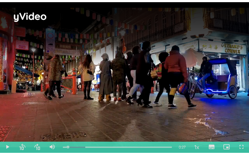
Thumbnail
As a developer, you can provide an Thumbnail for your video which gets displayed before playing the video itself.
How to:
- Open the Detail Panel and navigate to the Style tab to open the PlayerMode section.
- Now provide the
video\_\_posterby entering an url for an image resource.